Lead designer
Interaction designer
Visual designer
Prototype
Design system
Desktop web
Mobile web

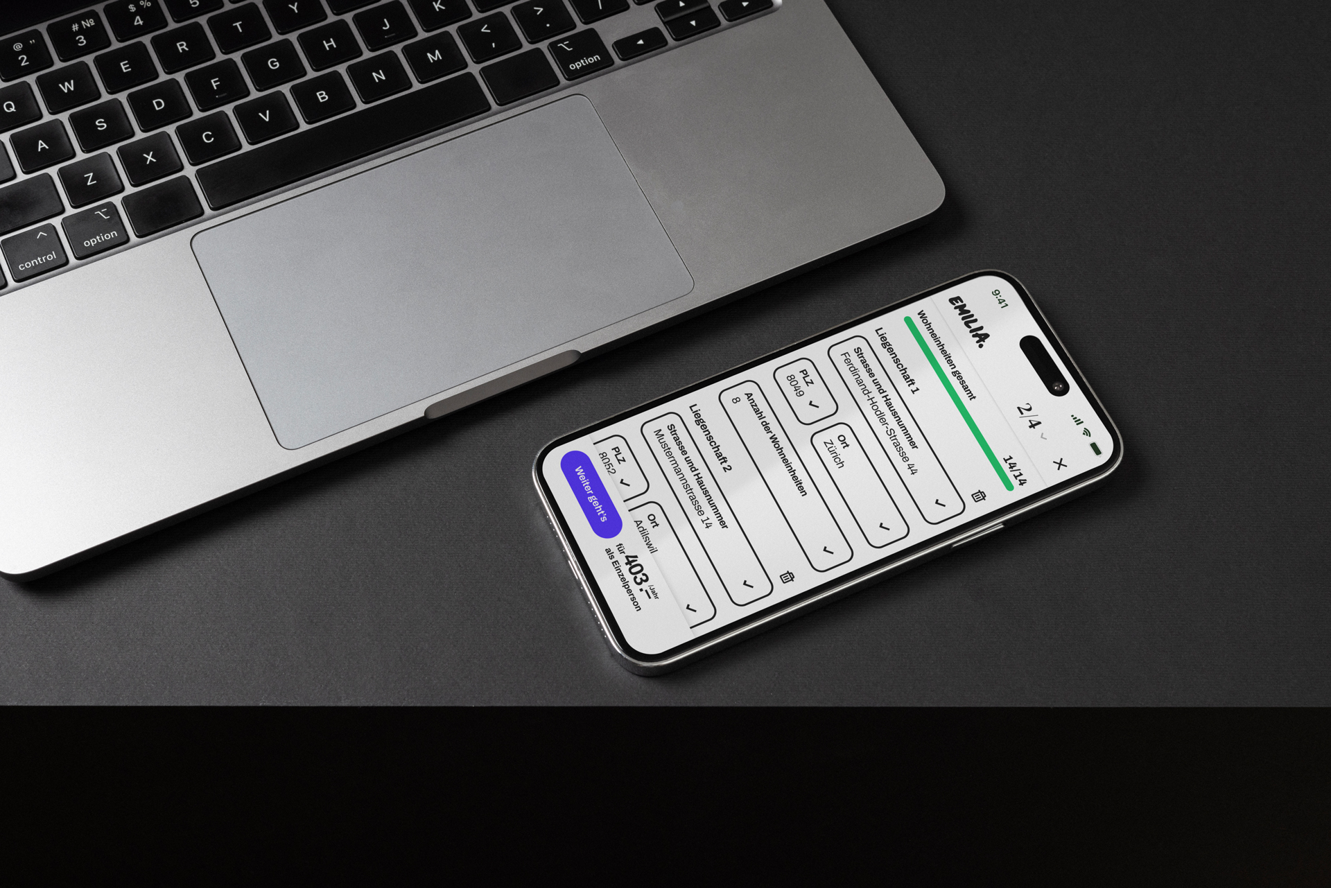
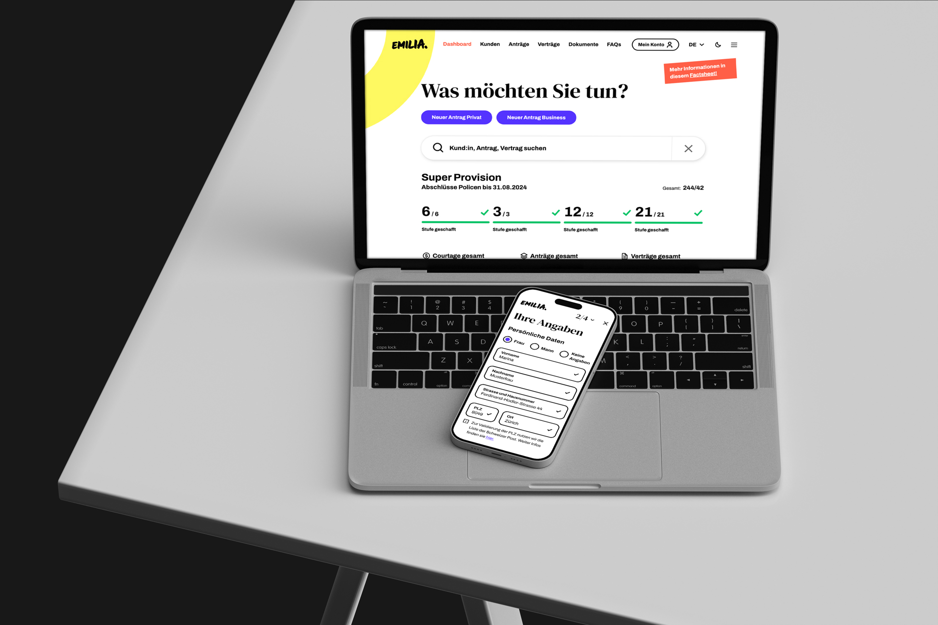
Emilia is a digital platform where private and business clients can sign up for legal protection insurance. I was responsible for designing a new feature that allows policyholders to insure multiple rental properties under a single policy — something that wasn’t previously possible. The goal was to expand product flexibility, reduce user friction, and open a new revenue stream for Emilia.

Until this point, Emilia users who owned multiple rental units had to buy separate insurance policies for each property. This approach was not only inefficient but also caused unnecessary administrative effort, user frustration, and potential drop-offs during the policy creation flow.
Stakeholders approached our team with a clear request:
“We need a way for landlords to insure several properties at once, easily, accurately, and without changing the rest of the flow.”
From a UX perspective, the challenge was to add a layer of complexity (multi-unit input, dynamic pricing, address validation) to an already well-established funnel without making it feel more complicated.

Success would be measured qualitatively by smoother policy creation, reduced broker involvement, and positive stakeholder validation.

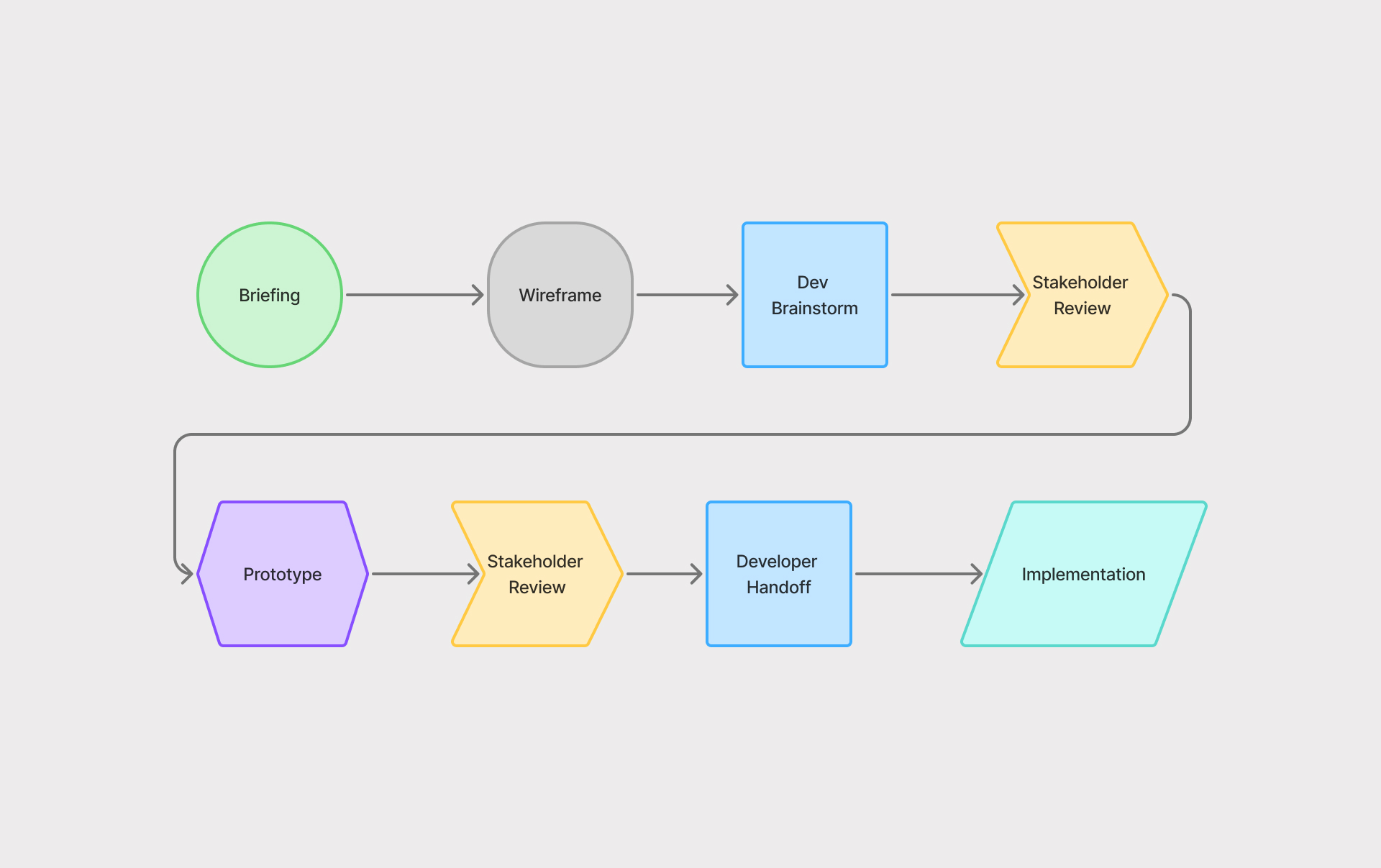
I started by reviewing the existing flow and the new requirements from the business and tech sides. The briefing was detailed but dense - multiple paths, conditions, and backend dependencies had to align.
I mapped out the key points where this new feature (Vermieterrechtsschutz add-on) would interact with the current structure:
After a few concept sketches, I shared the first flow proposals with developers and the project owner. We held a short brainstorming session to align on what was technically feasible and what would require backend adjustments.
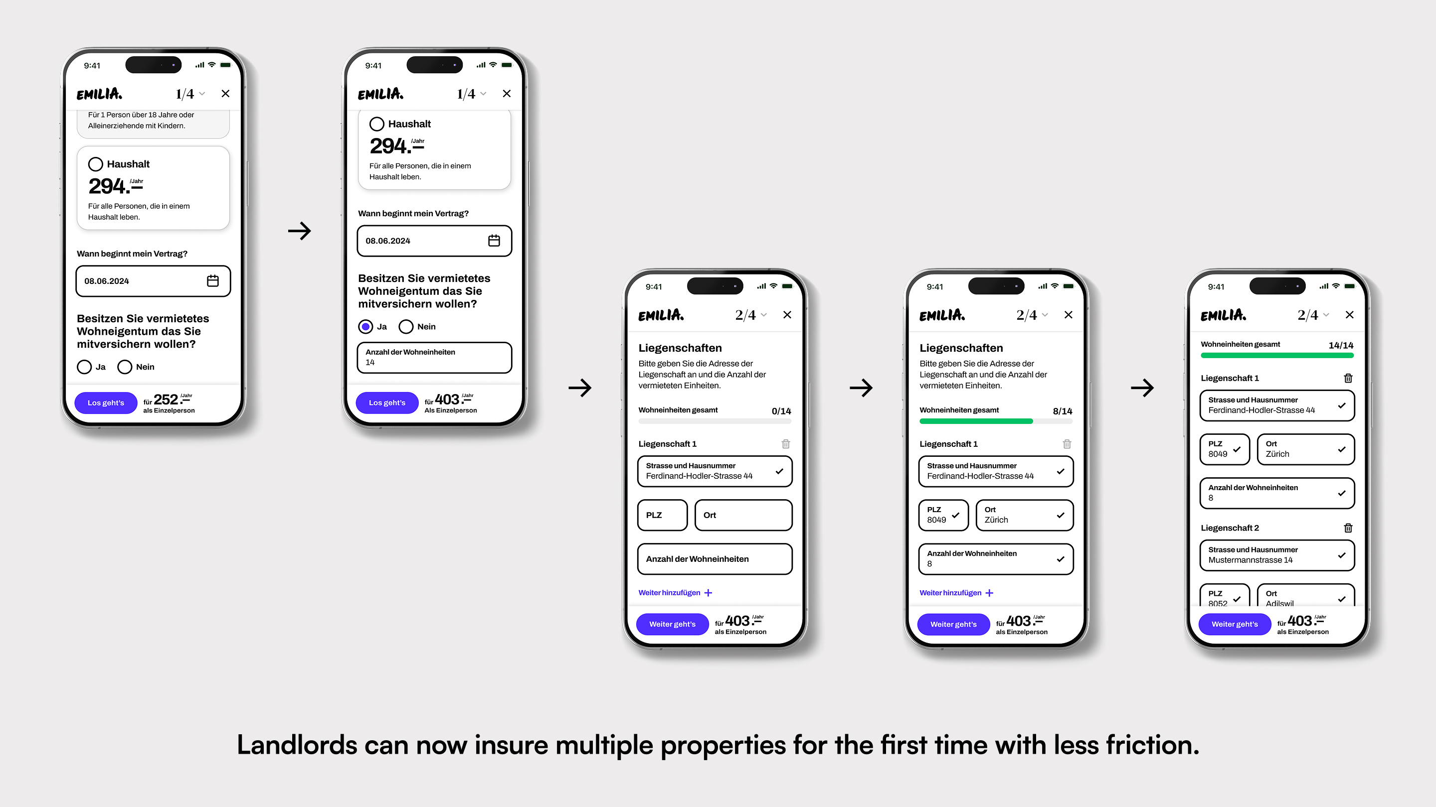
I created interactive prototypes in Figma, iterated based on feedback, and later refined the visual design using Emilia’s existing design system - introducing a new progress bar component that improved process visibility and was later added to the system library.

The final design allows users to:
This created a transparent, efficient experience for landlords who manage several units.
The “sticky progress bar” I initially designed was a UX highlight idea — giving users continuous feedback even while scrolling, but it was later replaced by a static version due to technical limitations.


The design was fully implemented and went live on Emilia’s PWA for both business and private clients.
For the first time, landlords could insure multiple properties within a single policy, a major UX improvement and business milestone. The feature simplified quoting and purchase, making Emilia more flexible and competitive in its market.
Internal feedback from stakeholders and developers was positive, emphasizing the clarity of the new flow and the ease of handoff.

Working on this project taught me a lot about designing for regulated industries, where UX progress often means simplification, not reinvention. I learned how to integrate complex logic (pricing, validation, data dependencies) within existing flows and how to advocate for small, meaningful interactions that improve user understanding.
This project also reinforced the value of cross-disciplinary collaboration: aligning business needs, backend logic, and user experience early on saved weeks of iteration later.